
Why “Pretty” Training Fails and What Actually Works

It had gradients, icons, and polished stock photos. The kind of training manual that looks amazing in a presentation.
The problem? No one on the team could follow it.
Not because they didn’t want to learn, but because it wasn’t designed to be used.
That’s the trap so many organizations fall into: training that looks good but doesn’t work.
The Real Goal of Training
Training isn’t about what looks good. It’s about what works.
Pretty slides might grab attention, but clarity keeps it. The goal of instructional design isn’t decoration. It’s direction. You’re not creating art. You’re creating something people can use to perform a task correctly, safely, and confidently.
Good training is invisible. It just works.
When I write or design training materials, I always come back to the same question:
If my grandma walked in tomorrow, could she do the job based on this manual?
If the answer is no, I’m not done.
Pretty vs. Practical
Aesthetics draw attention. Function earns adoption.
I’ve seen training programs that were visually beautiful but completely unusable.
One client sent me a 50 page SOP that was full of icons and abstract diagrams, but not a single clear verb. Each page was a guessing game. Employees were skipping steps, asking for clarification, or doing things “their way.”
Once we rebuilt it, step by step, something amazing happened. People actually used it. Mistakes dropped. Onboarding time was cut in half.
That’s the difference between pretty and practical.
Simple, Not Simplistic
“Make it simple, not simplistic” is my design mantra.
Simple doesn’t mean dumbing it down. It means removing friction.
Simplistic skips detail. Simple organizes it.
When training is simple, learners don’t have to think about the document. They can focus on the task. Every word, heading, and visual has a purpose.
Pretty training might impress in a meeting, but simple training performs in the field.
What Actually Works
Here’s how I approach every training project, whether it’s a one hour course or a two hundred page manual:
Understand the learner. Who’s using it, and what’s their starting point?
Map the process. Outline the real sequence of steps, not the “ideal” one.
Cut the fluff. Every line should drive action or understanding.
Design for usability. Color, hierarchy, and visuals should guide, not decorate.
Test it. If someone new can complete the task from start to finish, it’s ready.
That’s where instructional design and technical writing intersect: clear structure, purposeful visuals, and language people actually understand.
A Real Example
When I developed a training guide for a national facilities company, their first draft was text heavy with long paragraphs and zero visual cues. It was technically accurate, but no one retained it.
We reworked it to include icons, short bursts of text, interactive check ins, and fill in the blank reflections. The same information, but organized and approachable.
Supervisors reported that new hires were completing training faster and actually enjoying it.
That’s the magic of clarity. It turns information into confidence.
Clarity Is the Real Design
The best compliment you can get on a training manual isn’t “This looks nice.”
It’s “This makes sense.”
Clarity is what scales knowledge. It’s what turns documentation into trust and training into culture.
If your training looks great but doesn’t stick, it’s time to redesign for the way people actually learn.
Clarity is what makes training stick.
It’s what turns good information into confident action. And, that’s where I focus my work.
If you’re rethinking your training materials, I’d love to help you make them clear, not complicated.
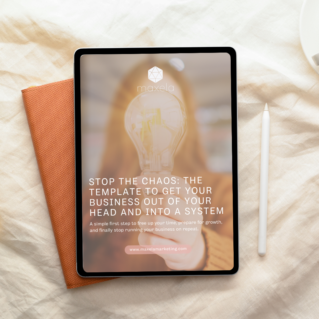
Tired of answering the same questions over and over?
My free Stop the Chaos template will help you capture one process and give your team the clarity they need.